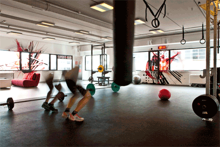
SUPERFITKLUB training Center
Graphics added into the space of SUPERFIT training center breaks the monotony of prefabricated architecture and lifts up motivation during training.
more about graphics...
SUPERFITKLUB training Center
Graphics added into the space of SUPERFIT training center breaks the monotony of prefabricated architecture and lifts up motivation during training.
more about graphics...
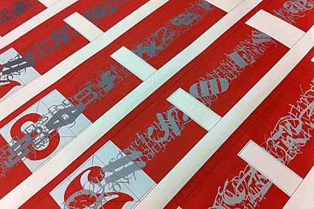
OFFICE ZAGREB
Characters are used when create news.
Croatian newspapers 24sata, Večernji list and Poslovni dnevnik have something to say, so they use big letters.
more about graphics...
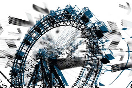
WIRTSCHAFTSBLATT
The graphic elements represent the iconised contents of WirtschaftsBlatt with the typical identification elements of Vienna and Austria.
more about graphics...
ARAHNE
Graphic design for Arahne company is allways a specila chalenge. The redesign of existing logotype, the promotional brochure, the backgorund of the showroom…

3k sport
The 3K triathlon club units different people but all of them have a big sport heart.

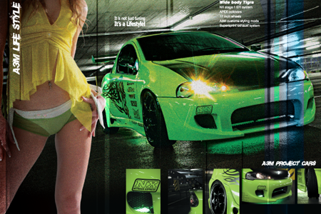
A3m
Appaerance of the catalog is expressing the strenght and poethics of a car redesign. The images were also used as the background for one of the client's showrooms.
arx1
Technical logo appaerance upgrades the innovative product in the perfected world of fingerprint recognition technology.

STRIBOG
Movement is representing the vortex, a music vortex of the Stribog music band, Stribog as a slavic wind god.

MOP
At releasing four different technical guidelines for the Ministry of the enviroment and spatial planning of Slovenia, the recognition, for both, the whole complex and each individual item was established by using a unique colour and pattern in the to many times black and white look of legislation.

KALČEK
The company was the first on slovenian market to sell organic food. Graphic design is a part of it.

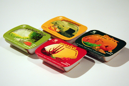
KALČKOVI NAMAZI
Designing the spread packaging for a brand name. The spreads made of organically produced ingredients are a total sales succes.


)
)
)
)
)
)
)
)
)
)
)
)
)
)
)
)
)
)
)
)
)
)
)
)
)
)
)
)
)
)
)
)
)
)
)
)
)
)
)
)
)
)
)
)
)
)
)
)
)
)
)
)
)